
Ai Content Generator
Ai Picture
Tell Your Story

 Ethan dante
Understanding Proximity in Web Design: The Secret to Visual Clarity
Have you ever visited a website and felt confused about where to look first? Or maybe the site seemed too cluttered, and you didn’t know what to click? This happens when the design is not clear. One important reason for this confusion is a lack of proximity in web design.
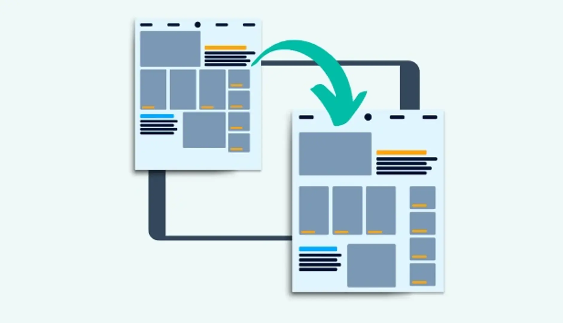
In simple words, proximity is how close or far elements are from each other on a webpage. It helps users understand which items are connected and which are not. When used properly, proximity can make a website look clean, organized, and easy to use.
In this guide, we’ll help you understand what proximity is, why it matters, how to use it correctly, and what mistakes to avoid. Whether you’re a web designer, developer, or beginner, this guide will help you create better websites with visual clarity.
What Is Proximity in Web Design?
The Core Principle of Proximity
Proximity is one of the most important design principles. It comes from Gestalt psychology, which studies how people see and group things visually. The Gestalt principle of proximity says that items placed close to each other are seen as a group. This happens naturally—our eyes and brains automatically group related things together.
For example, if you see a group of dots close to each other and one dot far away, your brain will think the close dots belong together, and the other one is separate.
In web design, proximity helps users understand which text, buttons, or images belong together. It brings visual order to your website.
Proximity vs. Spacing: What’s the Difference?
While proximity and spacing are related, they are not the same thing.
- Proximity is about relationships. It shows users that certain elements belong together.
- Spacing is about the actual distance between those elements.
You can have lots of space between groups of items and still use proximity well. The goal is to group related items closer and separate unrelated items with more space.
Let’s look at a quick example:
Bad Proximity:
- A headline is far from the paragraph that explains it.
- A form label is far away from its input box.
Good Proximity:
- The headline and paragraph are close together.
- The label and input field are side by side or stacked neatly.
Why Proximity Matters in Web Design
Enhances Readability
Web users scan pages quickly. They don’t read word by word—they look for patterns and groups. Proximity helps by grouping similar elements together so users can read and understand faster.
For example:
- A headline followed by a short paragraph is easier to read if they are close together.
- A bullet list looks clean when the items are evenly spaced.
Guides User Attention
Good proximity guides the user’s eyes from one section to the next. When related content is grouped well, it becomes easier to follow the flow of the page.
Example:
- On an e-commerce site, a product image, name, price, and “Add to Cart” button should be grouped tightly. This makes it clear they belong together.
Reduces Cognitive Load
When items are scattered and unrelated items are too close together, users have to think harder to make sense of the layout. This increases cognitive load, which is the mental effort needed to understand the page.
A clear structure created by proper proximity reduces confusion and helps users find what they need faster.
Boosts UX & Conversions
When your site is easy to understand and use, visitors are more likely to stay, explore, and take action—like clicking a button, filling out a form, or making a purchase. Good proximity contributes to a better user experience, which can lead to higher conversions.
Real-World Examples of Proximity Done Right
Website Header & Navigation Menus
Navigation links in a menu are usually placed close together. This helps users know they are part of a group. If one link is far apart, it might look like a separate page or action.
Product Listings on E-commerce Sites
Think of a product card:
- The image, product name, price, rating, and action button are all grouped closely.
- This grouping makes it easy to scan and compare multiple products quickly.
Contact Forms
A contact form is easier to fill out when each label is close to its field. For example:
- “Name” should be right above or beside the text input box.
- Grouping the name, email, and message fields helps users move smoothly from one to the next.
If the labels are far away, users get confused and may enter data in the wrong place.
Common Proximity Mistakes to Avoid
Overcrowding or Under-spacing
Putting elements too close together can make your design feel cramped and hard to read. On the other hand, putting too much space between related items can break the connection between them.
Solution: Keep related items close enough to form a visual group, but give them enough breathing room so the layout feels clean.
Misaligned Elements
Even if elements are spaced correctly, if they are not aligned properly, they look messy. Misalignment breaks visual grouping and weakens proximity.
Solution: Use design grids or guides to align text, buttons, and images.
Ignoring Mobile Responsiveness
On smaller screens, spacing needs to adjust. What looks great on a desktop might feel crowded or disconnected on a phone.
Solution: Test your design on all screen sizes. Make sure your proximity rules still apply when the layout changes.
Best Practices for Applying Proximity in Web Design
Use Grids and Layout Systems
Design grids help maintain consistent spacing between elements. Tools like CSS Grid or Flexbox make it easier to build layouts with clear structure and proper proximity.
Grids help:
- Align items properly
- Space out sections evenly
- Keep consistency across pages
Group Related Elements Intentionally
Think about what your users need to see together. Then place those items close to each other.
Examples:
- In a pricing section: Keep the plan title, price, features, and CTA button in one block.
- In a blog card: Keep the image, title, author, and “Read More” button grouped.
Leverage White Space Effectively
White space (also known as negative space) is the empty space between elements. It helps separate groups and gives your design room to breathe.
Tip: More white space between groups = stronger separation. Less white space within a group = stronger connection.
Use Visual Hierarchy Alongside Proximity
Visual hierarchy is about making important things stand out. You can use font size, color, bold text, and icons to show what matters most. When combined with proximity, it helps users scan and understand your page faster.
Tools and Techniques to Master Proximity
Design Tools with Alignment/Spacing Features
Modern design tools offer features to help you use proximity correctly:
- Figma and Adobe XD have rulers, grids, alignment tools, and auto-layout features.
- Sketch allows smart spacing between groups and layers.
These tools help you maintain consistency and reduce spacing errors.
Wireframes & Mockups
Before you create the final design, plan the layout using wireframes. Wireframes are simple black-and-white outlines that show the structure of your page.
Wireframes help you:
- Focus on layout and proximity without getting distracted by colors or images.
- Test different groupings to see what feels most natural.
Usability Testing
After designing your page, test it with real users. Watch how they move through the layout:
- Do they understand what items belong together?
- Are they confused by spacing or placement?
This helps you improve proximity and make the design more user-friendly.
How Proximity Fits into Overall UI/UX Design Principles
Proximity is just one of many design principles. But it works best when combined with others, such as:
- Alignment: Lines things up to improve visual order.
- Contrast: Highlights important information with color, size, or font.
- Repetition: Reuses styles or patterns for consistency.
- Balance: Creates equal visual weight across the page.
Together, these principles create a beautiful and functional design.
Proximity especially works well with:
- Visual hierarchy (what users notice first)
- Consistency (how spacing and layout repeat across pages)
- Clarity (how easy the design is to understand)
When you apply these principles together, your design feels professional, trustworthy, and user-friendly.
Conclusion
Proximity may seem like a small detail, but it plays a big role in web design. It affects how your users see, understand, and interact with your content. When you use proximity correctly:
- Your pages look cleaner and more professional.
- Users find what they need faster.
- Your website becomes more effective at converting visitors into customers.
Remember the key rules:
- Keep related elements close.
- Separate unrelated elements.
- Use white space wisely.
- Align items properly.
- Test your design on different screens.
Start looking at websites around you and notice how proximity is used. Practice grouping elements when you design, and your websites will become clearer, better, and more powerful.
Related Posts
© 2025 Invastor. All Rights Reserved
User Comments